less、sass换肤方案记录
前言
现在换肤的场景越来越多,特此总结一下自己使用过切实可行的两种换肤方案,less和sass各一种,less配合的vue项目,sass配合的react项目;大体的思路都是一样的:
1.将主题会用到的颜色都使用变量定义;
2.使用less/sassmixin和函数实现不同主题的颜色选取;
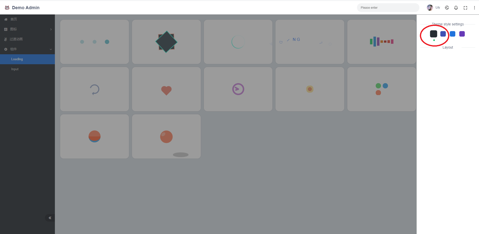
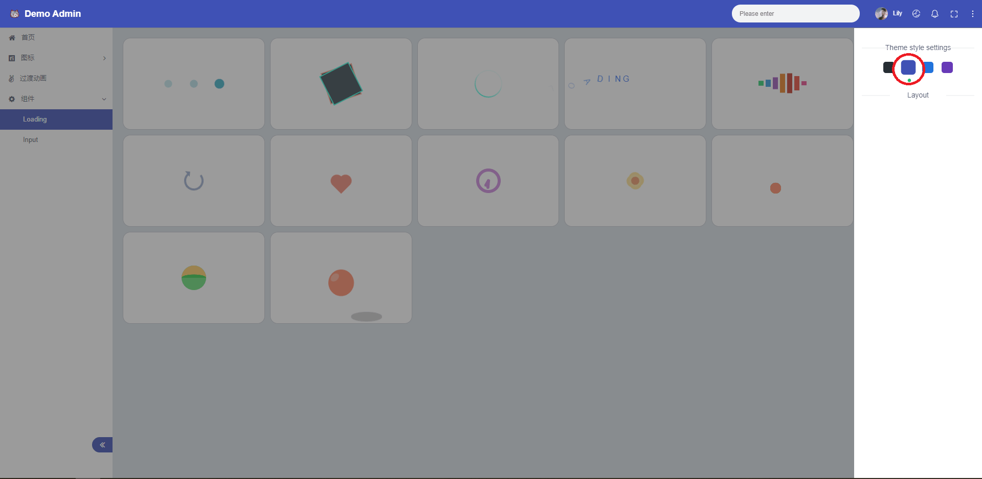
3.在body上放一个用于区别主题的类名或者属性,通过动态更换这个类名,实现主题的切换;
Less
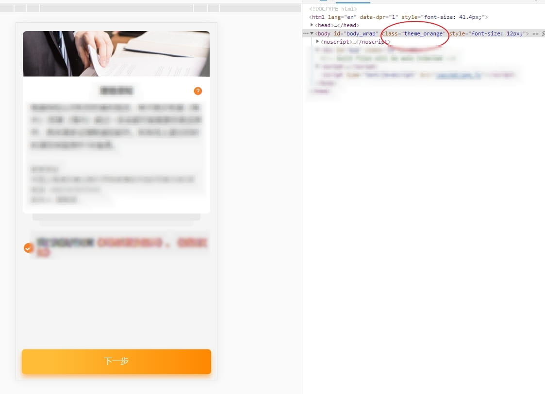
1.效果
定义了两套主题:蓝色和橙色
先看效果吧,把类名改为theme_blue切换为theme_orange主题直接就换掉啦~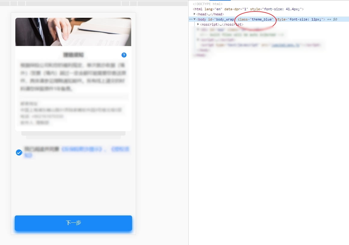
2.定义变量
- 定义变量;
- 定义了一个叫theme的mixin,把定义的变量传入mixin内部;
theme.blue.less
1 | //主题颜色 蓝 |
theme.orange.less
1 |
|
3.在less中使用
index.less
1 | // 公共样式 |
把有主题变动的元素写在
mixin内部,颜色都要使用mixin传进来的变量,这样当主题类名更换了之后,mixin传入的变量值就随之更换,从而更换了主题;
main.less
1 | // mixin调用 |
sass
1.效果
这里使用了React16的
context配合做的主题的切换;具体代码可以查看 上一篇博客;在这里我们只关注切换代码的css部分如何去实现;
2.定义变量
_variable.scss
1 | // 全局变量 |
3.定义mixin
_theme.scss
1 | // 引入变量 |
4.在sass中使用mixin
layout.scss
1 | // 引入mixin |
本博客所有文章除特别声明外,均采用 CC BY-NC-SA 4.0 许可协议。转载请注明来自 上野!
评论